
The Awareness Company
Brand Guide
The Awareness Company is a data and intelligence company that helps property and infrastructure enterprises operate smarter and more sustainably. With HYDRA, our software platform, we unify energy, water, waste, security, climate and compliance data into one aggregated, real-time view across all sites.

Hello.
Welcome to The Awareness Company's brand guide. This is our north star, the holy grail of how we feel about what we do, why we do it and how it should all be done.
If you're reading this, it means you're one of us, chosen to help us make everyone a hero for planet, people and profit.
So, grab a cuppa and let's begin.
Our Foundation
The core beliefs that drive everything we do
Our Vision
Every person in every organisation is a hero for planet, people, and profit.
Our Mission
Make data joyful and easy for business.
Personality
Daring, spirited, unique, cool
Intelligent, leader, technical, reliable
Voice
Tone
Our Values
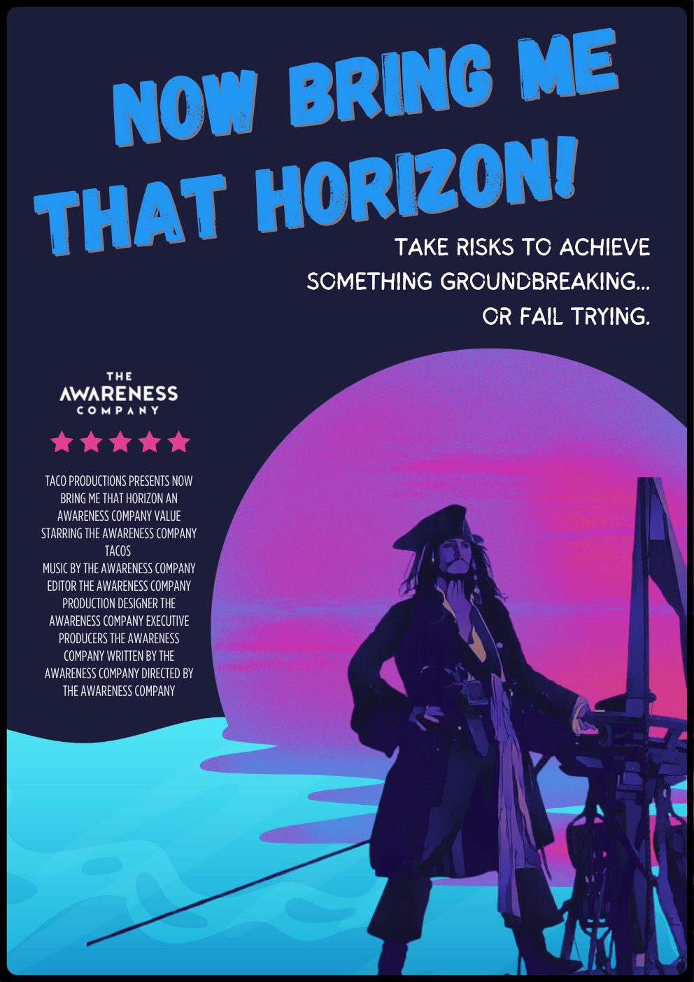
Bring Me That Horizon
Dare to seek out problems and create solutions. We face challenges head on, with confidence and resilience.
Learn something new every day to improve and grow. We say "no" to status quo.
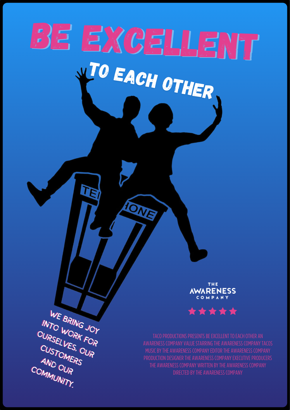
Be Excellent to Each Other
We appreciate each other as humans, as colleagues and as friends. We build genuine connections around the things that matter to us.
Quality tacos, only.
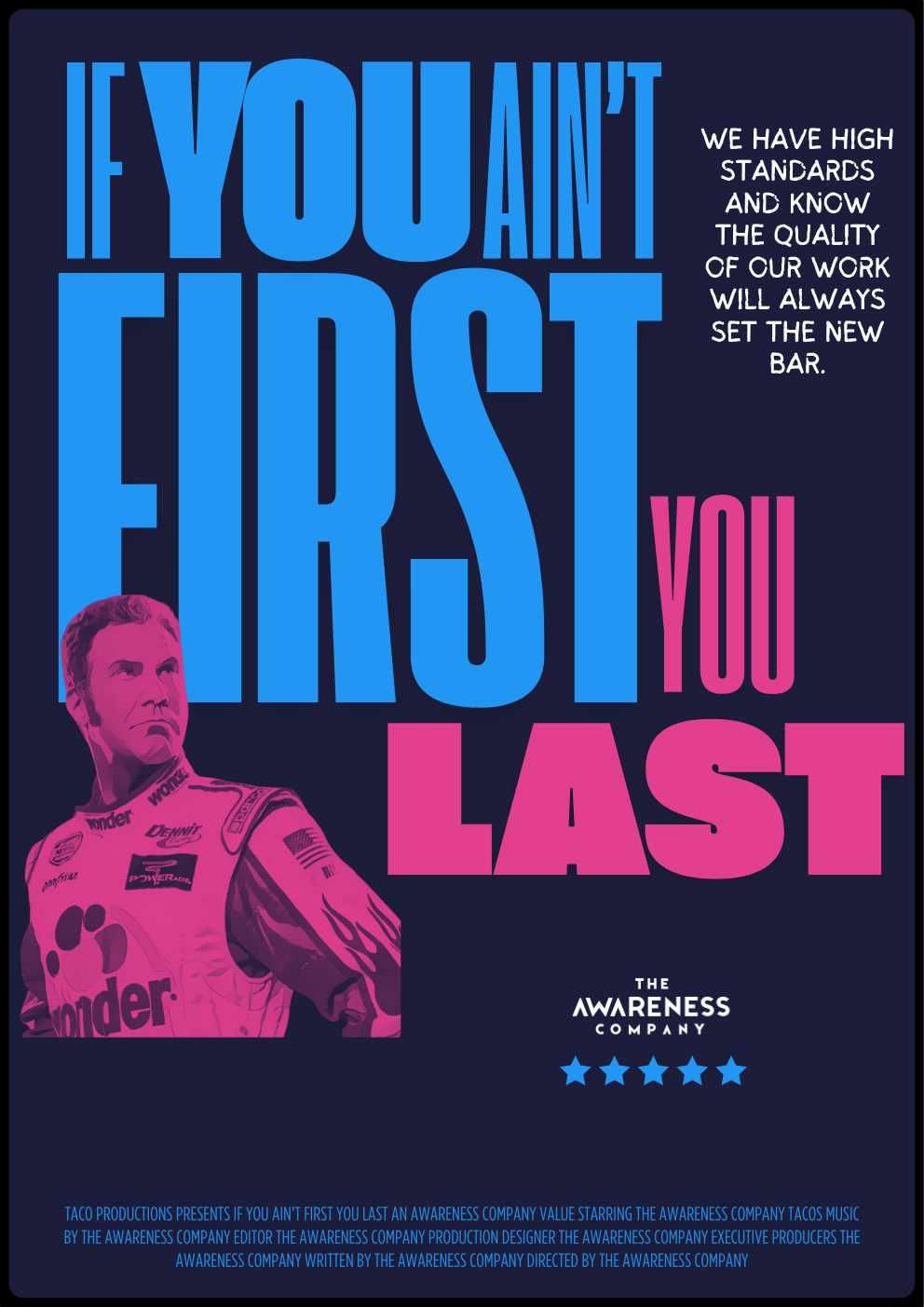
If You Ain't First, You Last
We act like owners - proactive, accountable, and with a deep love for what we do. We communicate and collaborate proactively, openly and with radical candor.
We move fast with intensity and high energy.
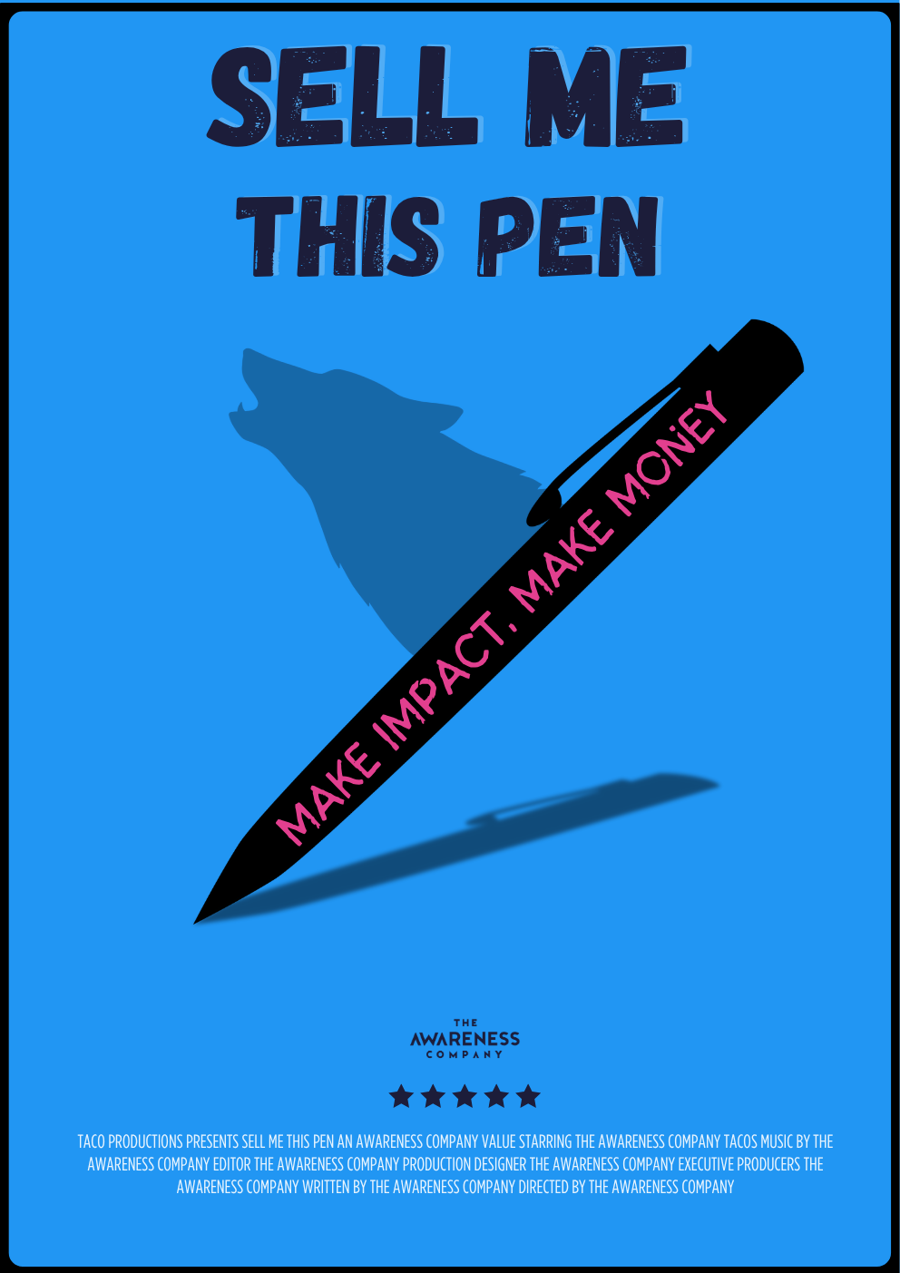
Sell Me This Pen
We believe in the golden triangle of sustainability: operations, impact and finance.
We strive for tangible, measurable impact for people, planet AND profit.
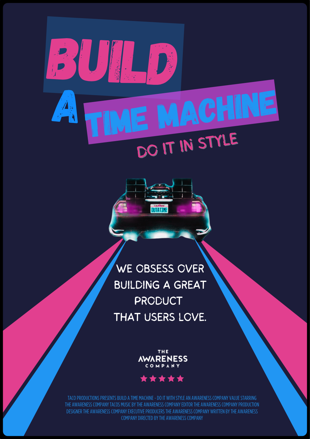
Build a Time Machine - Do it with Style
We push the boundaries to redefine what's possible with data + AI. The user is the centre of our HYDRAverse.
Our aim is to inspire joy, surprise, and delight with every interaction.
Logo System
This is our primary logo. The Awareness Company Visual Identity is more than a badge or logo: it stands for who we are. It is a visual representation of our brand, our values and our commitment to accelerate the world's awareness so that all decisions are smart, fast and data-driven.
Primary Logo
Full Logo
Logo Mark
Wordmark
Logo Variations
White Background
Dark Background
Blue Background
Light Gray
✓ Do
- • Use approved colour combinations
- • Maintain minimum clearspace
- • Use on appropriate backgrounds
- • Keep proportions intact
- • Use high-resolution files
✗ Don't
- • Use unauthorized colours
- • Place on busy backgrounds
- • Stretch or distort
- • Add effects or shadows
- • Use low-resolution files
Colours
Colour is a great identifier: we can use colour to influence the way people think about us and build strong associations with our brand and our products. Proper application of the primary corporate colour palette helps to ensure a consistent and credible communication of the company.
Navy
HEX: #1c1d3a
RGB: 28, 29, 58
Primary color used in titles and backgrounds
Dark Navy
HEX: #05061a
RGB: 5, 6, 26
For backgrounds that need to be darker than Navy
Blue
HEX: #2196f3
RGB: 33, 150, 243
Primary accent color for icons, sub-headings and shapes
Purple
HEX: #2e2c7a
RGB: 46, 44, 122
For shapes and tables
Pink
HEX: #e23f8f
RGB: 226, 63, 143
Accent color, use minimally
White
HEX: #ffffff
RGB: 255, 255, 255
For headings and backgrounds
Typography
Our typographic system creates hierarchy and ensures consistency across all communications.
Primary Typeface
Poppins Semi Bold
70 PT
Headings
30 PT
Sub Headings
20 PT
Body Text
Arial
20 PT
Our story begins with rhinos, like all good stories do. With over 10 years in defense, safety and security, creating anti-poaching technology, we saw first hand the value technology brought to people. To solve real-world problems. This sparked our passion and our vision for the future: To accelerate the world's awareness and make every person better at what they do using data.
Icons
The Awareness Company icons are flat and use a line illustration style of drawing. Please ensure that the colour and thickness of the lines in the icon illustrations are consistent.
Global Reach
Energy
Monitoring
Team
Precision
Innovation
Data Grid
Surveillance
Growth
Design
Obsess over customer experience
Example of icon usage with messaging
HYDRA
HYDRA is our software solution and a sub-brand of The Awareness Company. HYDRA is a visual representation of how we take an influx of data and transform it into stories that are easily understood and interpreted into action.
Platform Overview
The HYDRA wordmark may ONLY be used in the colour combinations shown. Clearspace equal to the HYDRA 'A' must be maintained around the HYDRA Wordmark in every application. No other visual element may intrude within this clearspace.
Primary Blue
Dark Background
Light Background
Imagery & Photography
Our visual language combines space exploration themes with data visualization, creating a unique aesthetic that represents our mission to explore new frontiers in data intelligence.
Photography Style
- • Space and cosmic themes
- • Modern technology and data centers
- • Clean, minimalist compositions
- • High contrast with deep blues and purples
- • Professional, aspirational imagery
- • Avoid cluttered or busy backgrounds
Visual Elements
- • Geometric patterns and grids
- • Data visualization graphics
- • Subtle gradients and glows
- • Astronaut and space exploration motifs
- • Clean line illustrations
- • Consistent colour palette usage

Space Exploration
Astronauts, cosmic scenes
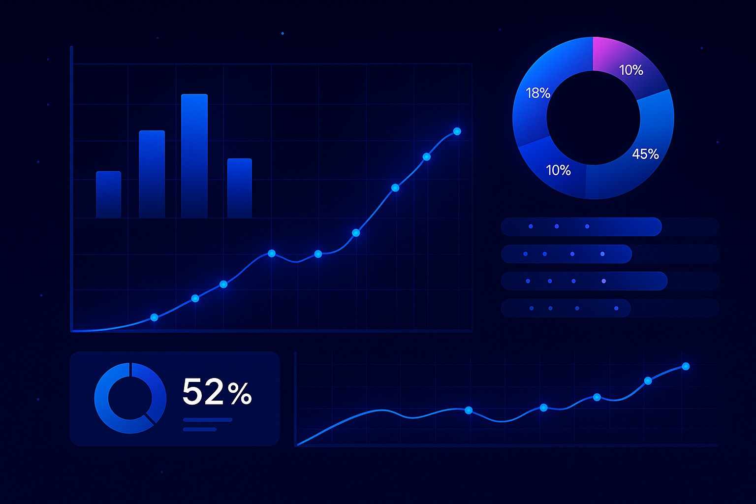
Data Visualization
Charts, graphs, dashboards
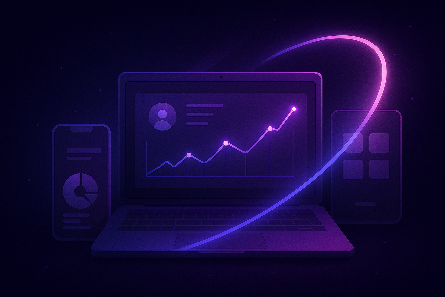
Technology
Modern devices, interfaces

Sustainability
Green energy, environment